Case Study: J’s Juke Joint
Responsive Website
The product:
J's Juke Joint is a restaurant that blends soul with elegance. This family owned and operated business located in the southern suburbs of Atlanta, Georgia. J's strives to deliver a great experience that matches its great food. Many of their entrees and side dishes are from recipes that have been passed down by generation to generation. J's delivers a wide spectrum of foods all at an competitive price. So if you've had a hard days work, or its time to treat yourself simply to a delicious meal, J's Juke Joint is the right place for you.
Project duration:
December 1, 2022 - January 3, 2023
Project Overview
The Problem:
The restaurant needs a more resourceful way for customers to be able to order food before getting to the restaurant to bring down wait time and to better the customer’s experience.
The Goal:
Create a website that allows customers to order online and allows them to have an accurate ready time to enjoy their meal.
My Role:
IUX Designer / UX Researcher creating a responsive website for J’s Juke Joint.
Responsibilities:
Brainstorming, conducting interviews, wireframes, building lo-fi and hi-fi prototypes, completing usability studies, accessibility and iterating designs.
User Research: Summary
Customers have complained about the wait time inside of the restaurant. To better J’s customer’s experience, we created a website that will allow customers to order online and give them an estimate pick up time to bring down inhouse waiting. While doing interviews on the website we concluded that many people loved the site, but did find a few things that was concerning to some.
With the Specials and Catering sections, a few wished the entire section was clickable not just the “view more” button. The other was the anchor links on the home page to the menu sections, but it was explained that they will work proper once sent to front-end designers to complete for the actual website. In all, we was able to create a website that will better the user experience and help the growth of J’s Juke Joint.
User Research: Pain Points
Time
Pick up times may be incorrect
Pace
Customer’s feeling rushed due to large crowds waiting to place orders.
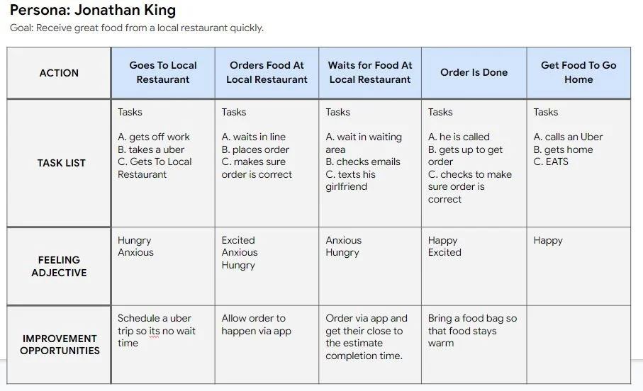
Persona: Jonathan King
Problem statement:
Jonathan King is a young, driven UX designer who needs timely service because he works long hours and needs his rest when off.
User Journey Map
Mapping King’s journey map shows how beneficial it would be to have an app for the Local Restaurant.
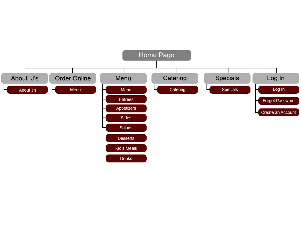
Sitemap
Many of the users loved that the links to the pages was simple and to the point. Which makes for a pretty easy sitemap that looks similar to other responsive websites that deal with restaurants.
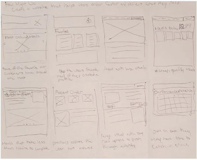
Paper Wireframes
Next, I put together paper wireframes for each screen of my responsive website, taking in consideration the pain points users had.
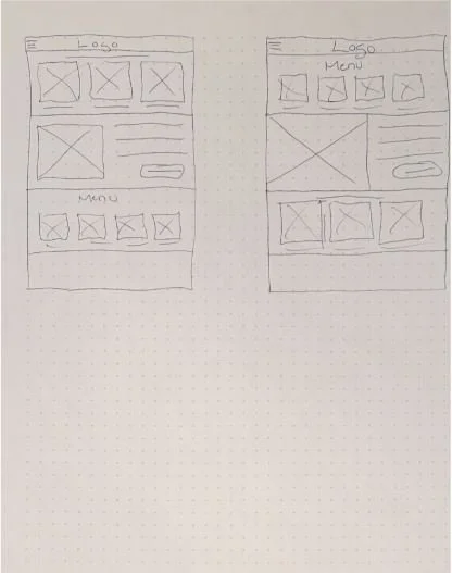
Paper Wireframes
screen size variation(s)
Since customer’s may access J’s Juke Joint’s website on different platforms. I created layouts for different screen sizes
Digital Wireframes
Creating a digital wireframe now focused more on the things users loved and worked to simplify the ordering process to get them exactly were they wanted to be, without to many decisions.
Special Features:
- Anchor bar for specific menu selections
- Specials on item many customer’s have come to love
Digital Wireframe
Screen Size Variation(s):
Low-Fidelity Prototype
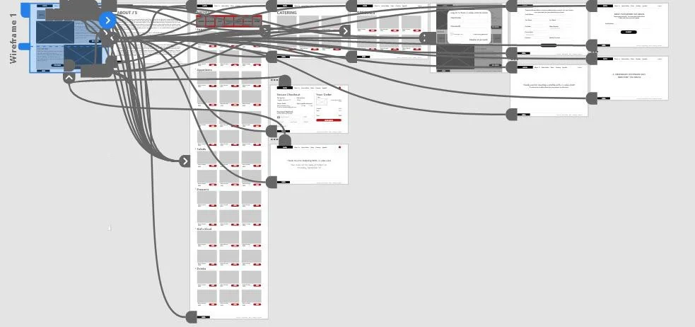
To create the low fidelity prototype, I connected the completed wireframes to link together to deliver a real response so that users could experience a mock up of the future website.
At this point, I have received feedback to complete a lo-fi prototype that could deliver a great experience the users are looking for with their critics.
View: J’s Juke Joint Lo-Fi Prototype
Usability Study: Parameters
Study type:
Unmoderated usability study
Participants:
5 participants
Location:
United States, remote
Length:
20-30 minutes
Usability Study: Parameters
What was concluded with the use of the usability study.
Finding:
The users wanted to be able to select entire sections instead of just a link. Specifically for the Specials and Catering sections on the home page.
Finding:
Correcting the anchor links to go to the correct sections from the home page to the menu page.
Finding:
Customer’s love the simplicity and familiarity of the website.
Mockups
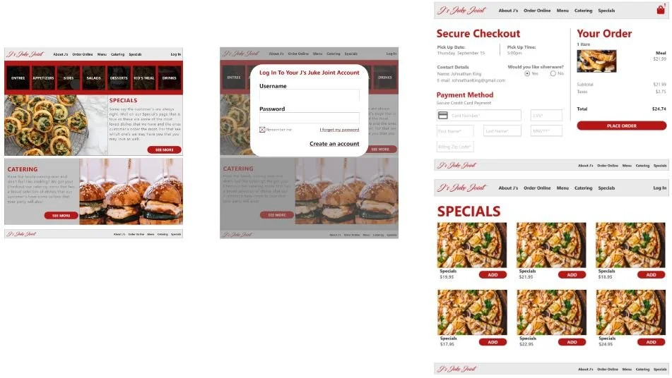
One of thing that was corrected was being able to select the sections of the Specials and Catering locations so that not only is the button clickable, but the section is clickable now.
Mockups
Also to show how the anchor links will work on the home page, the anchor links on the menu page were completed so that they could experience clicking the tab that will take them to their wanted location on the menu page. (the home page will work the same after sent to front end engineer to complete.)
Mockups: Original Screen Size
Mockups: Original Screen Size
Taking into consideration that many people will be looking at this website from different devices, we went ahead and created a mock-up for a mobile phone.
This allow for the user to still have a great experience while ordering online from their mobile device and not feel the need to be on a desktop computer and also not to discourage them from doing business with the company.
High-Fidelity Prototype
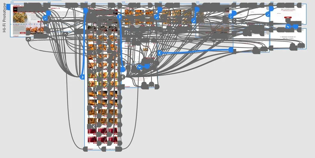
My high fidelity prototype used the same connections as the low-fidelity prototype with minor changes completed to make sure the user has a great experience.
Accessibility Considerations
1.
I used 3 main headings to help the user to understand the hierarchy on each page.
2.
Created prominent buttons that are consistent on the website so the user knows where to click.
3.
I designed the page with specific alt text so that each page as screen reader access.
Takeaways
Impact:
Our target was to create a simple, yet effective responsive website that delivers many of the things users desire from a restaurant website. We wanted to create something that was unique, but familiar so that users have the feeling that they been there before when it could be their first time all while making it visually pleasing.
What I learned:
I’ve learned that what may be small to me may be huge to another user and how they may maneuver through a website. Making those small little change just might be the thing that makes users continue to choose a restaurant over another.
Next Steps
1.
Finalizing and conduct one more usability study before sending live.
2.
Checkout online reviews and see if it is any recommendations, or things we may have missed in the near future.
LET’S CONNECT!
Thank you for taking time out of your busy life to review my work on J's Juke Joint responsive website. If you would like to get in contact with me, or see more results, please feel free to contact me at:
Email: jerryowhite@gmail.com | Website: jerryowhite.com


